When a page feels slow, the culprit is usually not the code. It is the images. A 4000-pixel phone photo gets sent, untouched, to a 400-pixel-wide mobile screen, and the visitor pays in megabytes for detail they will never see. Add a missing alt text and a file called IMG_4821.jpg, and you lose on speed and search visibility at the same time.
The good news is that image optimization comes down to a handful of clear rules, and most of them run on their own once they are set up properly. This guide covers what you need to know, from choosing a format to responsive images, lazy loading and alt text, and then shows which parts Sem CMS handles for you.
TL;DR: Serve images in a modern format (WebP or AVIF), send each device a file at the right width (srcset and sizes), lazy-load images below the fold but never the main above-the-fold image, reserve space with width and height to stop layout shifts, and write meaningful alt text. Solving this at the system level beats doing it by hand.
Why images have such an outsized effect on page speed
On most web pages, images account for the largest share of bytes. Two of Google's Core Web Vitals, its user-experience metrics, are directly tied to them:
- LCP (Largest Contentful Paint) measures how quickly the largest element on screen appears. On many pages that element is a hero image or a product photo. A good score is under 2.5 seconds.
- CLS (Cumulative Layout Shift) measures how much content jumps around while the page loads. An image without declared dimensions pushes the text below it down when it arrives. A good score is under 0.1.
Page speed alone will not guarantee rankings; content always comes first. But a slow page loses visitors in the first few seconds, and for anyone on mobile data it is a real cost.
Picking the right format: JPEG, PNG, WebP, AVIF and SVG
| Format | Best for | Keep in mind |
|---|---|---|
| JPEG | Photos | Universal support, but larger files than modern formats |
| PNG | Graphics that need transparency, screenshots | Far too heavy for photos |
| WebP | Most photos and graphics | Supported by all current browsers; handles transparency |
| AVIF | Photos where compression matters most | Often smaller than WebP; slower to encode |
| SVG | Logos, icons, simple illustrations | Sharp at any size, but it is a text file that can carry scripts |
By Google's own measurements, lossy WebP files are roughly 25-34% smaller than JPEGs of comparable quality, and lossless WebP is around 26% smaller than PNG. That makes WebP the safe default today: every current browser supports it, and one format covers both photos and transparent graphics.
SVG deserves its own warning. It is not really an image but an XML document, and it can contain script tags or event attributes such as onload. Publishing third-party SVGs without sanitizing them is a security hole.
The right size: responsive images with srcset and sizes
The right format is only half the job; the pixel width has to fit the screen too. Shipping a 1600-pixel hero to a phone gives back everything you gained through compression. The fix is to offer the browser several widths of the same image:
<img src="hero-800.webp" srcset="hero-400.webp 400w, hero-800.webp 800w, hero-1600.webp 1600w" sizes="(max-width: 768px) 100vw, 50vw" alt="...">
srcset lists the versions you have; sizes tells the browser how much of the layout the image will take up. The browser then picks the best file for the screen width and pixel density. Upscaling a small image to create a "high-resolution" version achieves nothing, though: the result is just heavier and blurrier.
Compression: balancing quality and file size
With lossy compression, dropping quality a little below 100% cuts file size dramatically with no visible difference. For photos, a quality setting of 75-85% is a sensible starting point on most sites. One caveat: compressing the original and saving over it is a one-way decision. The healthier approach is to keep the original at full quality and serve optimized copies to visitors.
Lazy loading: defer what is below the fold, never the hero
The loading="lazy" attribute tells the browser not to download an image until the visitor scrolls near it. Loading only what is visible, instead of all ten images in a long article, makes the first view noticeably faster.
The classic mistake is lazy-loading the main image at the top of the page as well. The browser then discovers the LCP element late, and LCP gets worse. The rule is simple: the above-the-fold hero loads immediately, ideally with fetchpriority="high"; everything else can wait.
Prevent layout shifts: width and height
If the browser does not know an image's dimensions until the file arrives, it cannot reserve space, and the page jumps when the image loads. Setting width and height attributes, or an aspect-ratio in CSS, lets the browser save the right amount of space up front and keeps CLS down.
Image SEO: alt text, file names and sitemaps
- Alt text: Describe what the image shows, briefly and concretely. Not "image1" but "Attic study with exposed timber beams". Screen readers read it aloud and search engines use it to understand the image. For purely decorative images, an empty alt is correct.
- File names:
timber-beam-attic-study.webpsays far more thanIMG_4821.jpg. The same logic applies to an SEO-friendly URL structure. - Context: Headings, captions and the text around an image reinforce what it is about.
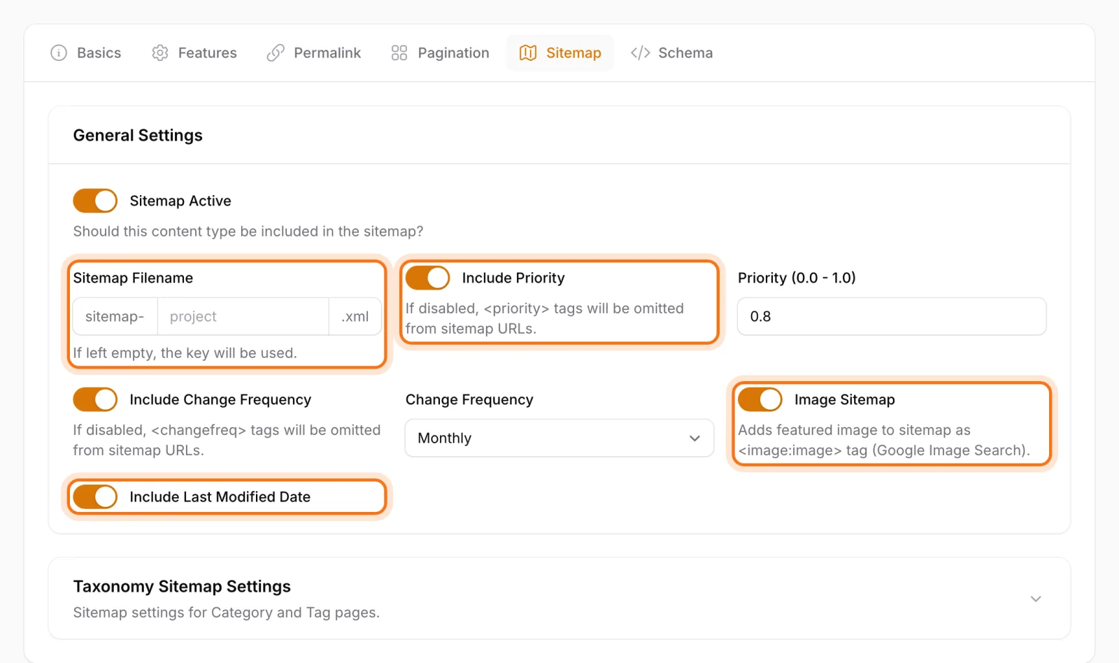
- Image sitemaps: Image entries in your sitemap help Google discover your images. Google deprecated most image sitemap tags in 2022; the image URL is what really matters.
- Sharing image: A 1200×630 Open Graph image is the common standard for pages shared on social networks.
Image optimization checklist
- Serve photos as WebP (or AVIF) and keep the original separately.
- Generate several widths per image and use
srcset/sizes. - Never upscale small images.
- Add
loading="lazy"to below-the-fold images, not to the hero. - Declare width and height, or an
aspect-ratio. - Write concrete alt text for every meaningful image and give files descriptive names.
- Never publish third-party SVGs without sanitizing them.
- As traffic grows, consider serving images through a CDN.
How Sem CMS handles image optimization
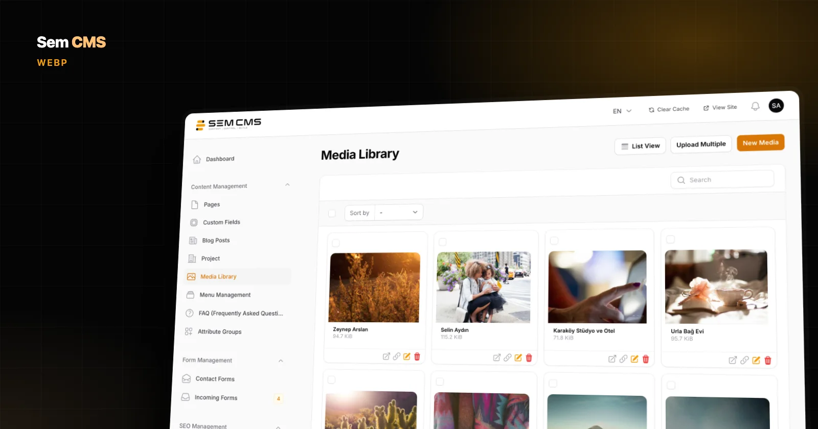
In Sem CMS, a good part of that checklist is left to the system rather than to an editor's memory. Uploaded files are not compressed or resized on upload; the original is stored as-is. Optimization happens on the visitor's side: when a theme renders images through the system's image component, every library image is offered to the browser as WebP versions at 400, 800, 1200 and 1600 pixels wide via srcset.
- Each version is generated once, on first request, and stored; later visitors get the ready-made file.
- Nothing is upscaled: a 900-pixel image is never stretched to 1600.
- The component lazy-loads by default, and theme developers can switch that off for the hero image.
- In our testing, WebP versions served instead of PNGs came out 76-79% smaller.
An honest note: these responsive versions are generated only when the theme renders the image through that component and the image was uploaded through the panel. Images from external URLs and the theme's own asset files are not covered.
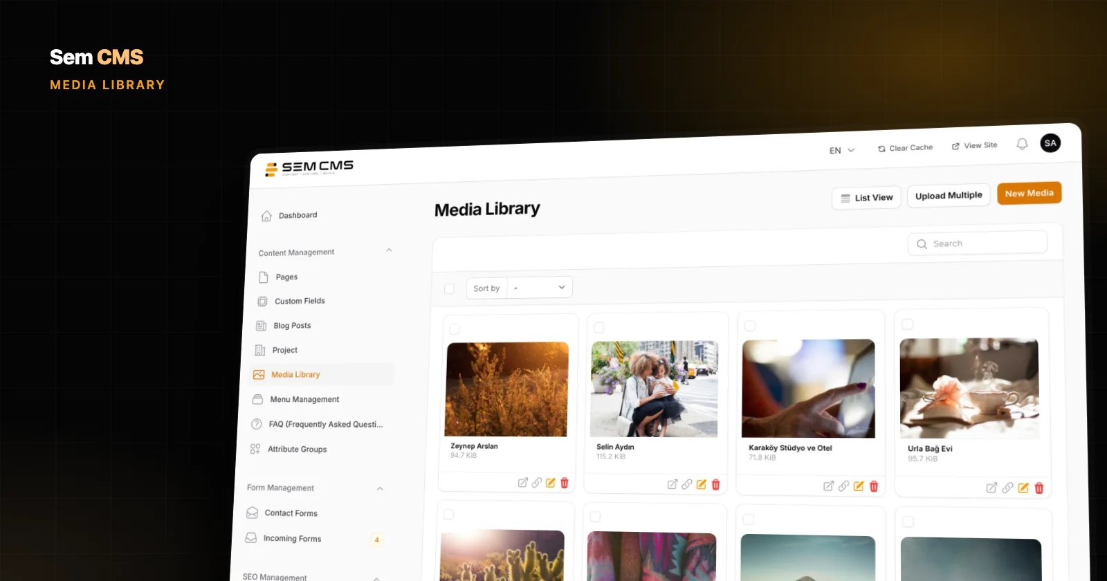
An image's descriptive details travel with the file. Every image in the media library has alt text, title, caption and description fields, and the default templates fall back to the content title when a featured image has no alt text.
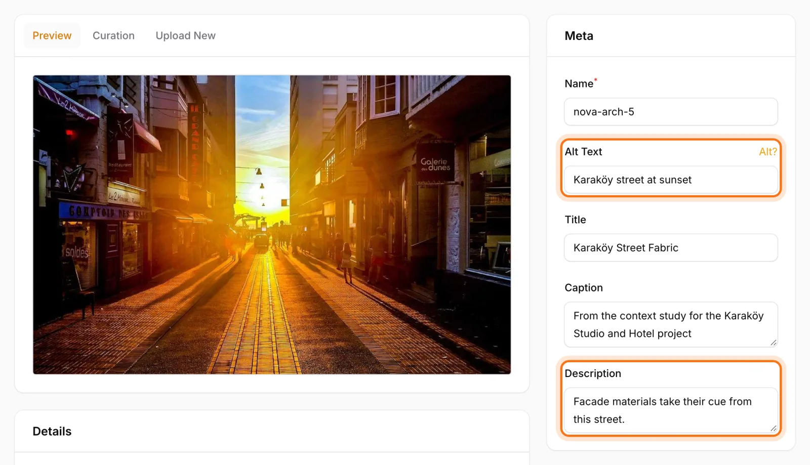
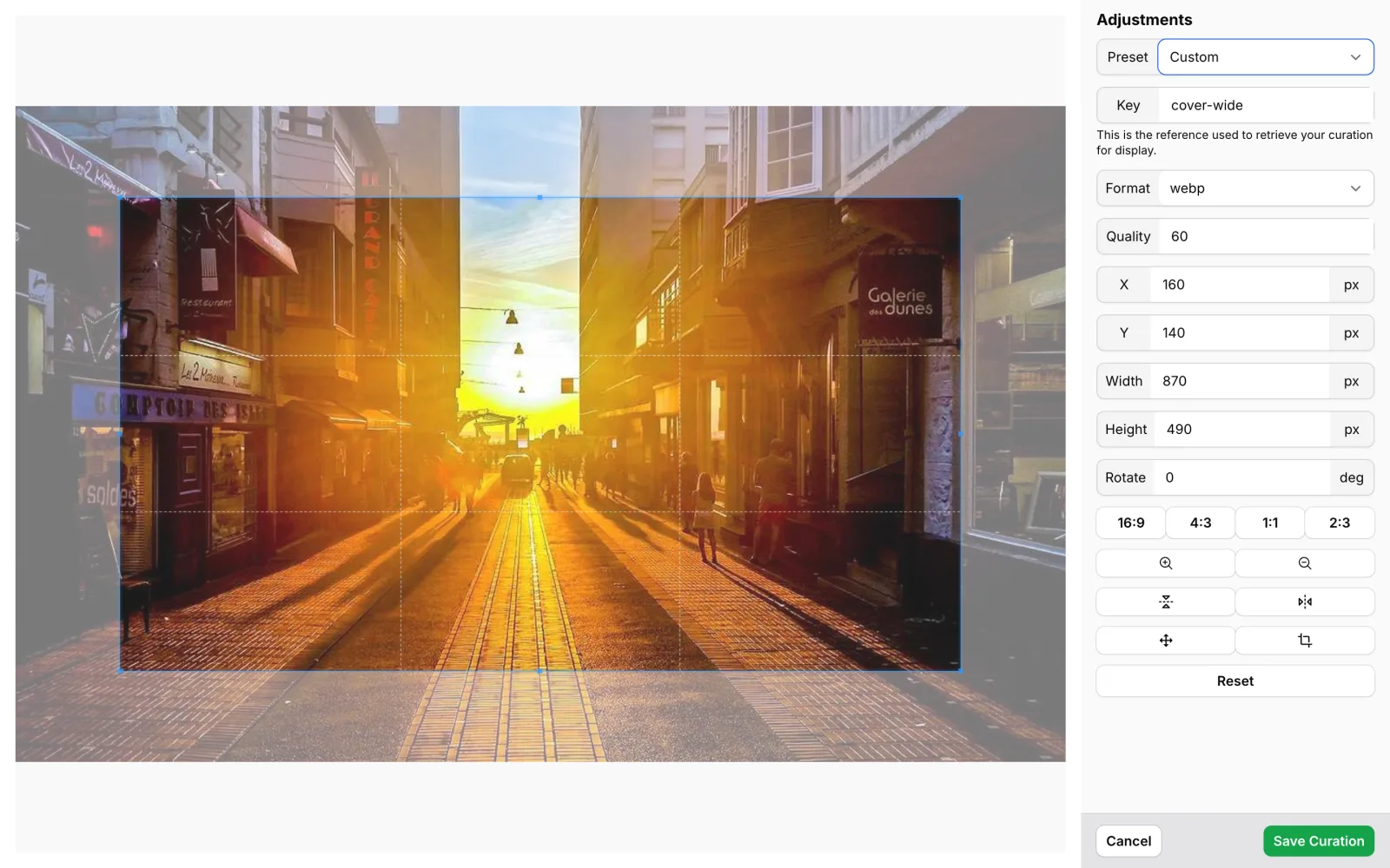
When you need a specific framing, the crop tools let you create different crops of the same image, saved as JPG, PNG, WebP or AVIF, while the original stays untouched. Uploaded SVGs are automatically stripped of scripts and event attributes.
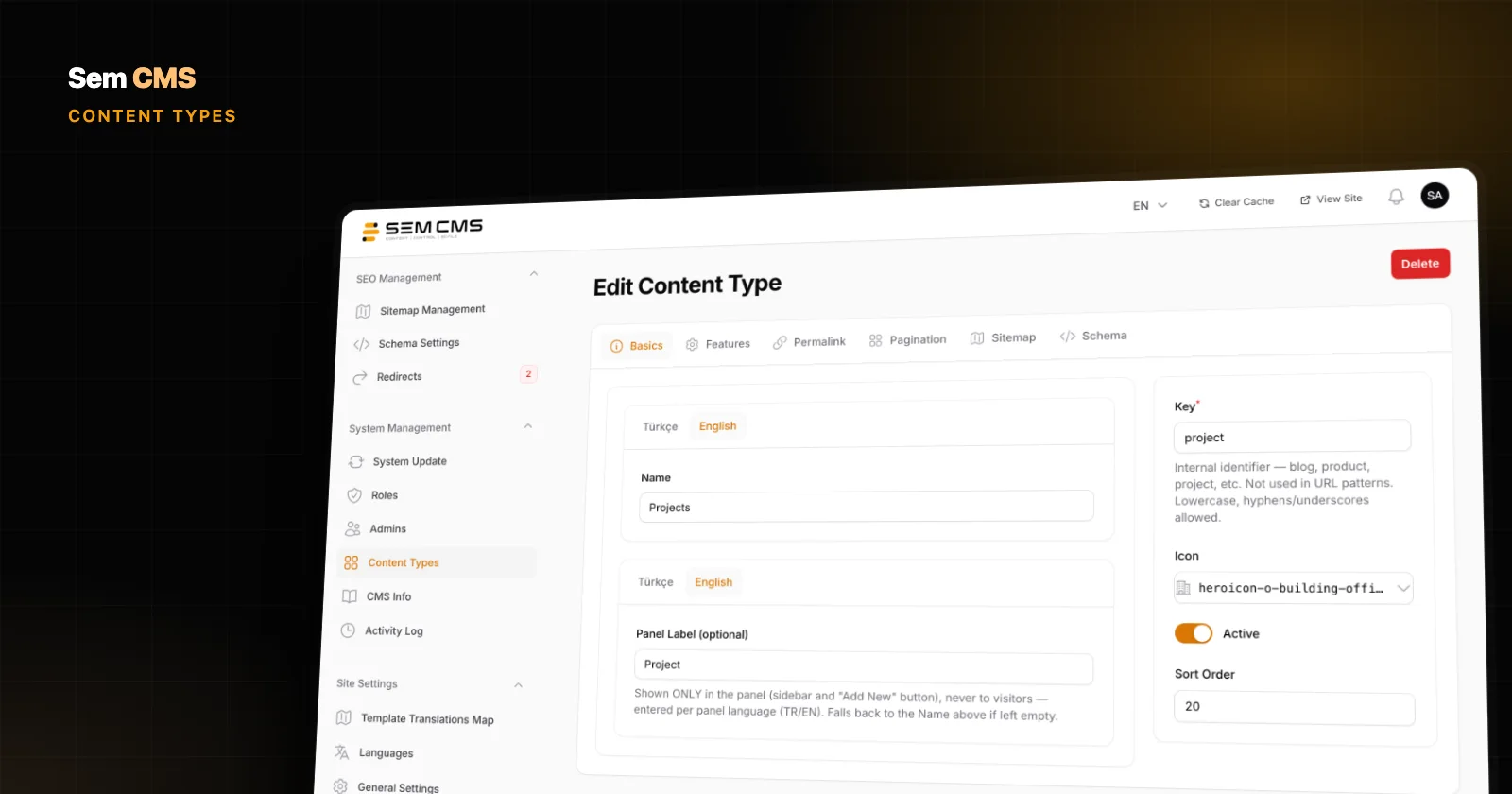
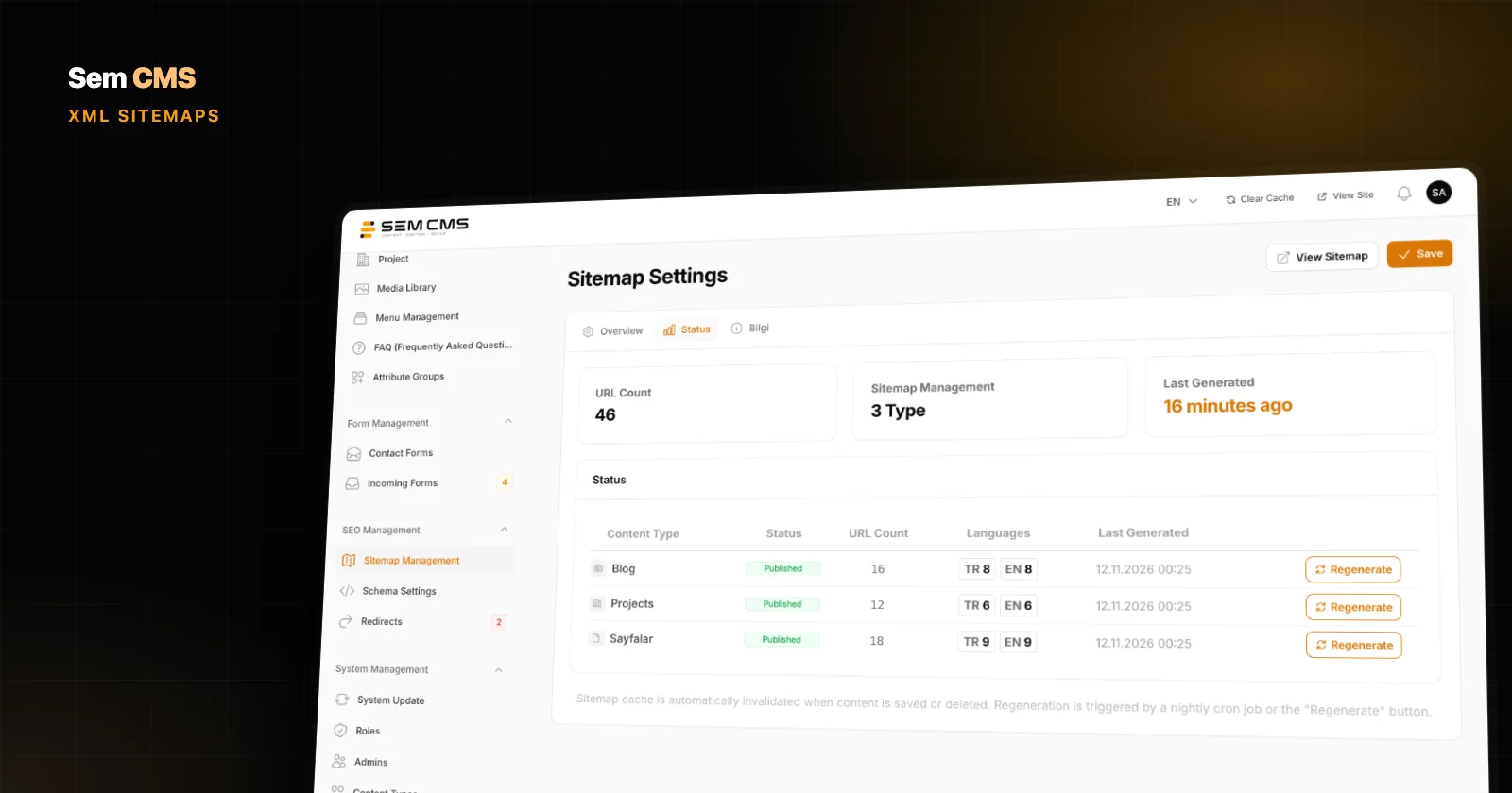
On the discovery side, image entries in the sitemap can be switched on or off per content type, and each item can have its own Open Graph image for social sharing, with the featured image used when none is set. When traffic grows, a single switch in Settings serves media links from your CDN address, without touching any template files.
Bottom line
Image optimization is an infrastructure problem: set it up correctly once and it works for every new piece of content. The right format, the right width, a smart loading order and meaningful alt text are better entrusted to the system than to every editor remembering every rule.
For the details, read our posts on the media library, on how images appear in an automatic XML sitemap, and on how themes render images in the theme system. See every capability on our Features page, or request a demo to try Sem CMS with your own content.